
UX Design | UI Design | User Research | User Testing
Cashly
Secondary Feature
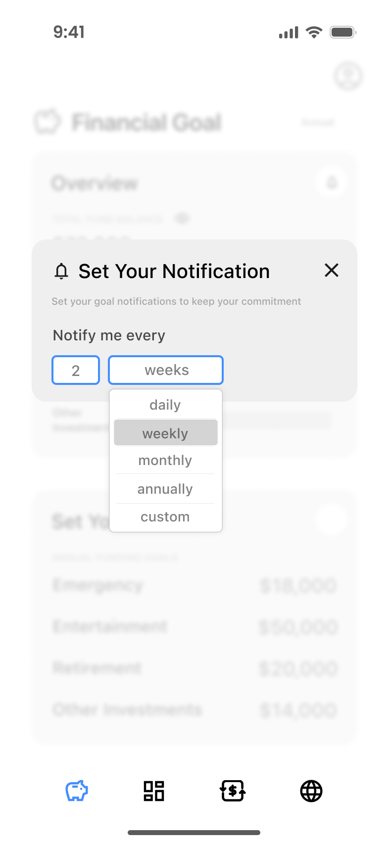
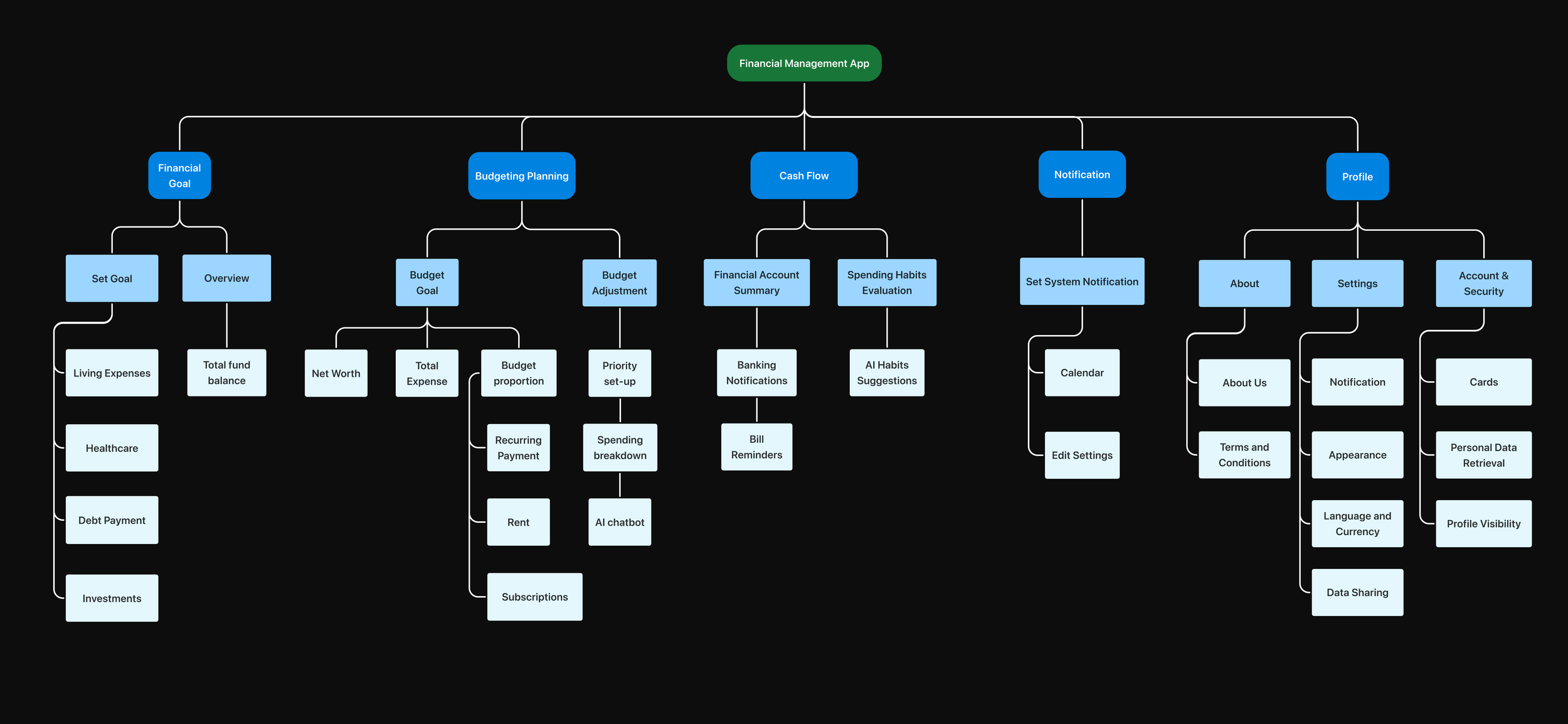
Notification Setting
Iterated Feature 2
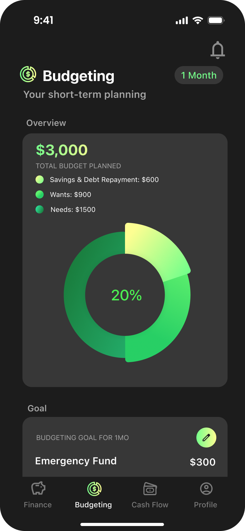
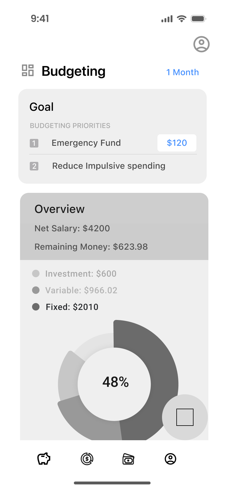
Budgeting
Iterated Feature 3
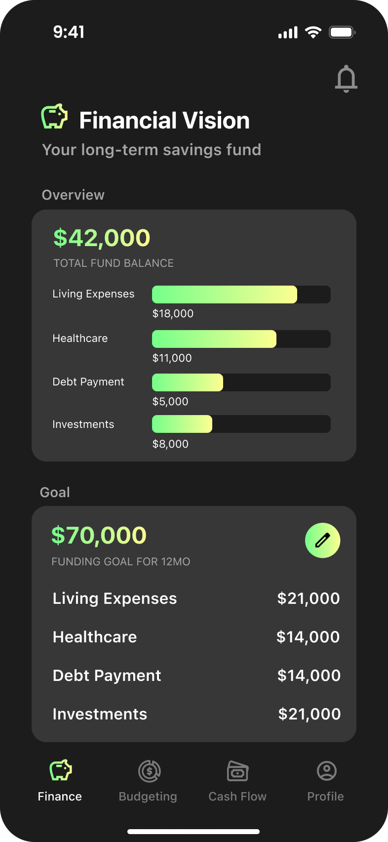
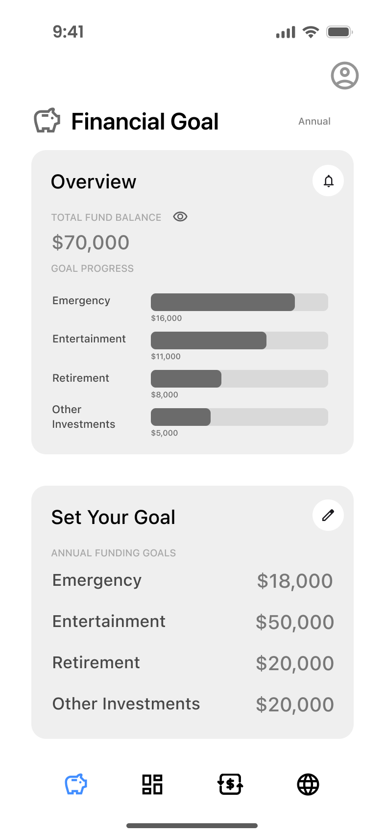
Financial Vision
Iterated Secondary Feature
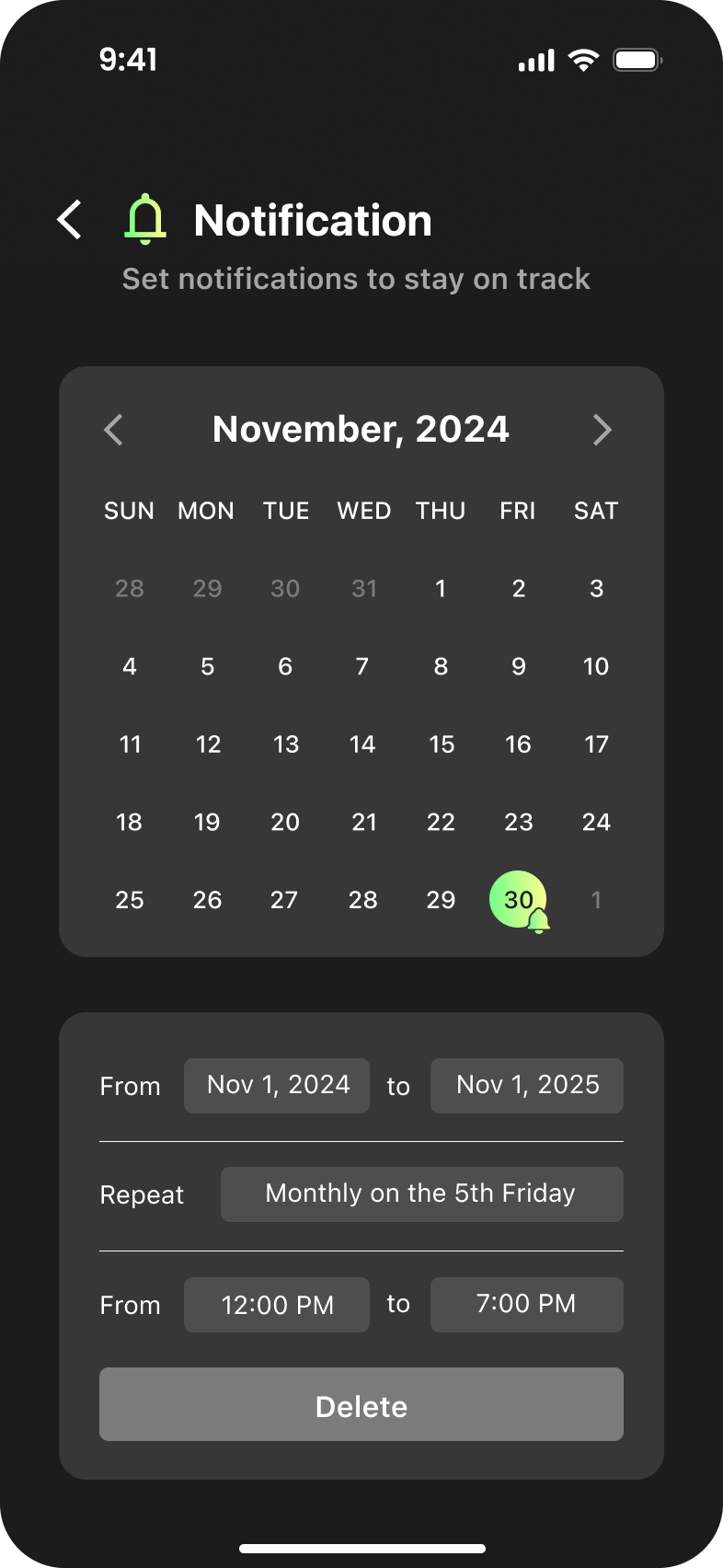
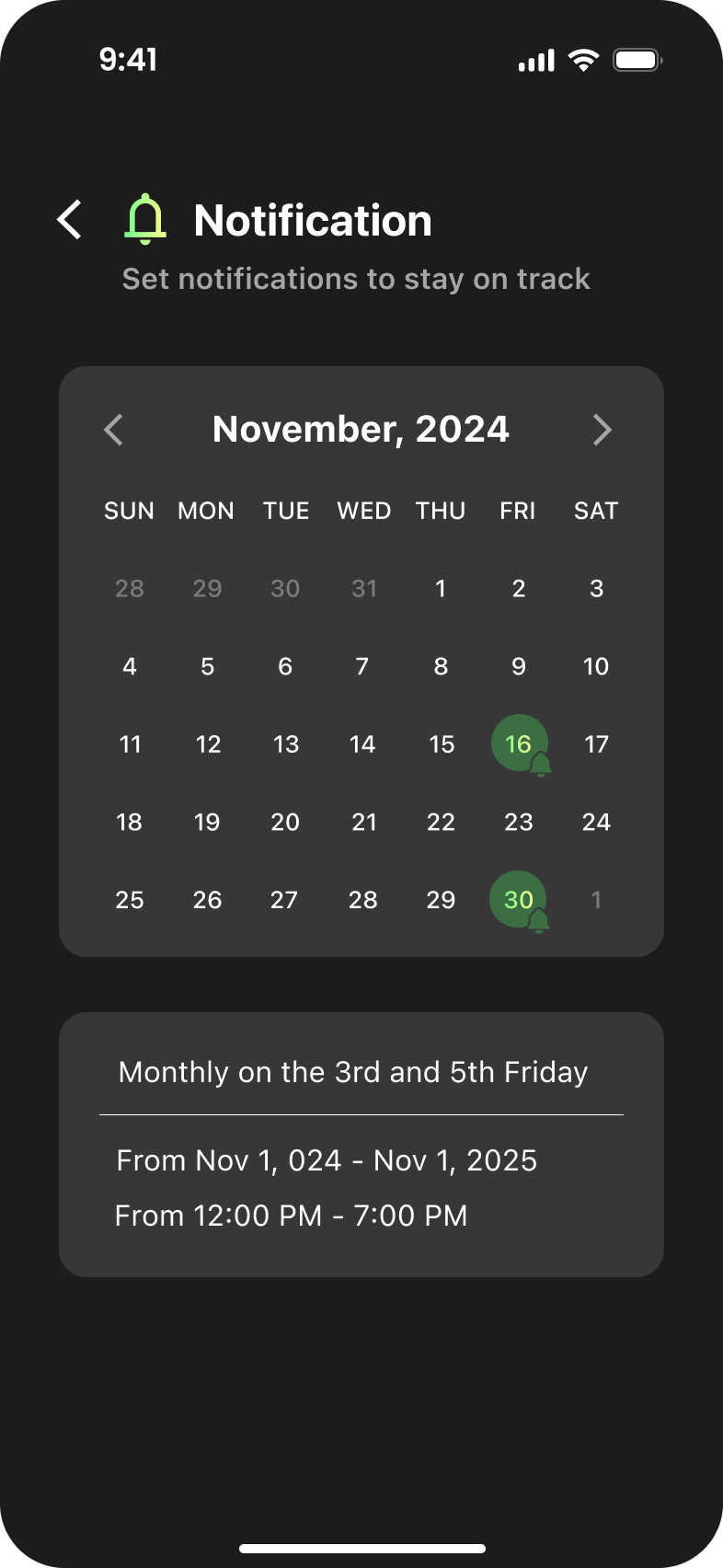
Notification
Cashly is a personal finance management application designed to provide personalized guidance tailored to each user's unique financial situation. The goal is to help build healthy budgeting habits and reduce the stress of managing short and long-term finances.

My Responsibility:
Ideation, Research, Design, Prototyping, Usability Test, and Iteration of Budgeting flow


Team:
Huiyang Chen , Yinjie Shi , Qizi Yu
Time length:
2 month
Problem statement
How might we assist individuals transitioning into the early career stage to manage personal finance, loan and tax understanding and to optimize spending needs and habits?
Research
We interviewed 6 individuals, aged 21 to 27, from various industries to understand their challenges in managing day-to-day budgeting and their concerns regarding personal finance.
“I started with plain money into saving stash. I figured out the phone, internet, groceries etc. divided the months by the weeks and figured how much I needed to make to make up each bill. I had envelopes by categories. I would figure out these categories first and whatever was left was my own spending money.”
“I kept postponing opening that checking deposit account because it was too much work to read through the policy. I didn’t know how to start or how it would affect the amount in my current checking account.”
Cash envelope system builds visual and emotional connections
The cash envelope system uses labeled envelopes to set spending limits, creating visual clarity and fostering mindful financial habits. Handling cash builds accountability, making budgeting simple and empowering.
Provide Guidance on Long-Term Financial Management
Desire for tools that provide both guidance and automation in financial management to replace emphasis on long-term financial security and independence.
Building Financial Resilience Through Early Education
Lack of early financial education limits long-term security. Teaching compound interest and investing early builds habits for financial resilience and confidence.
Insights


Insight 1
Both personas need visual cues to grasp spending allocation better. Sophia benefits from immediate visibility into daily expenses, while Michael focuses on balancing long-term allocations.
Cash-Envelope System Visualization
Visual representations of spending allocation across categories, updated in real-time. Visual cues to simulate the tangible feeling of spending physical money.
Insight 2
Sophia needs foundational guidance, while Michael seeks clarity on complex decisions.
Plain-Language Financial Insights
Step-by-step onboarding to assess spending stream, spending habits, and financial goals with actionable advice.
Insight 3
Sophia and Michael both need habit reinforcement.
Habit Formation
Immediate alerts when users make impulsive purchases or spend outside their predefined budget.
Ideation & Usability Testings
Leveraging the design opportunities uncovered through extensive research and user interviews, we were able to pinpoint the minimum viable products (MVPs) essential for addressing user needs and aligning Cashly with the product-market fit.
Usability test preparation deck can be found here
Feature 1
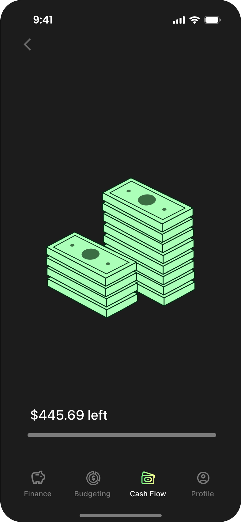
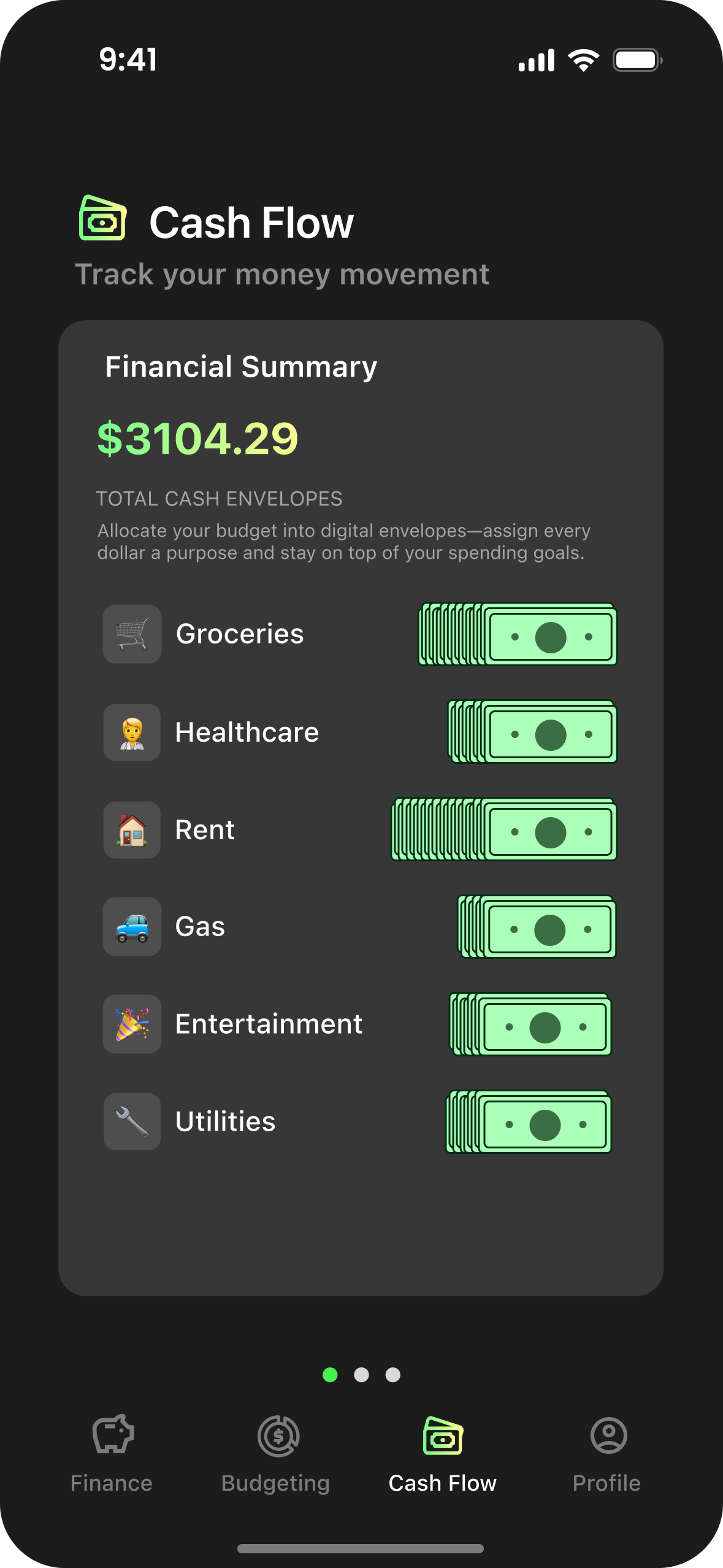
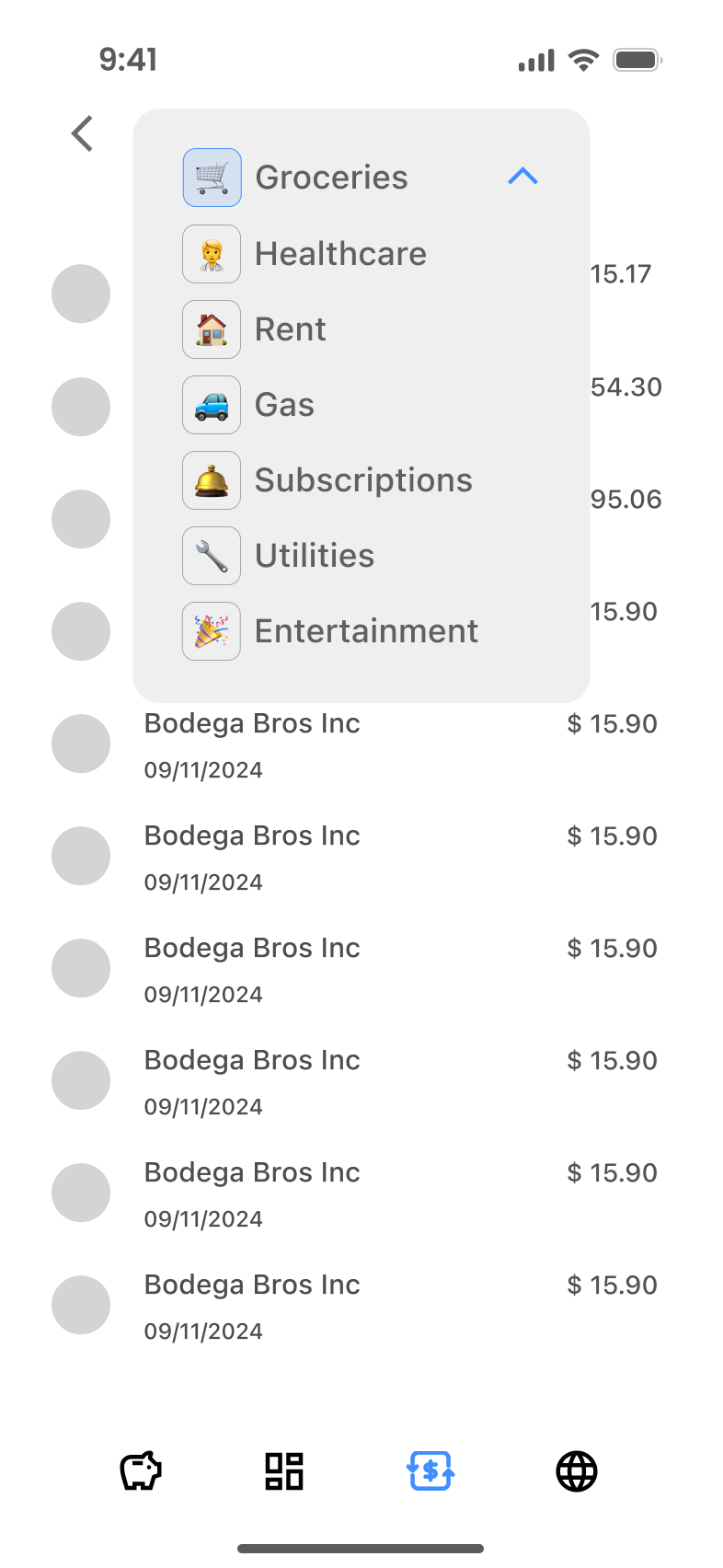
Cash Flow
Feature 2
Budgeting
Feature 3
Financial Goal
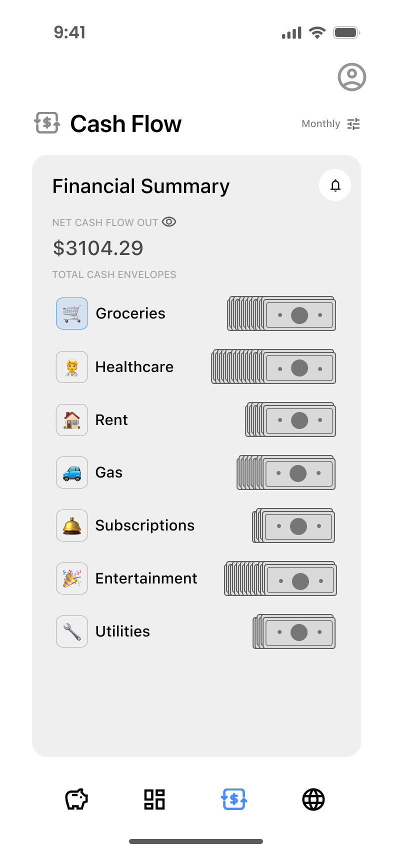
Enhancing Clarity and Usability in Cash Flow Management
Users desire greater clarity and intuitive interactions in navigating and understanding cash flow data, including detailed breakdowns, customizable views, and seamless transitions between categories and timeframes. Simplifying visual cues, improving navigation (e.g., swiping indicators, clickable categories), and prioritizing relevant timeframes like monthly summaries could significantly enhance the user experience.

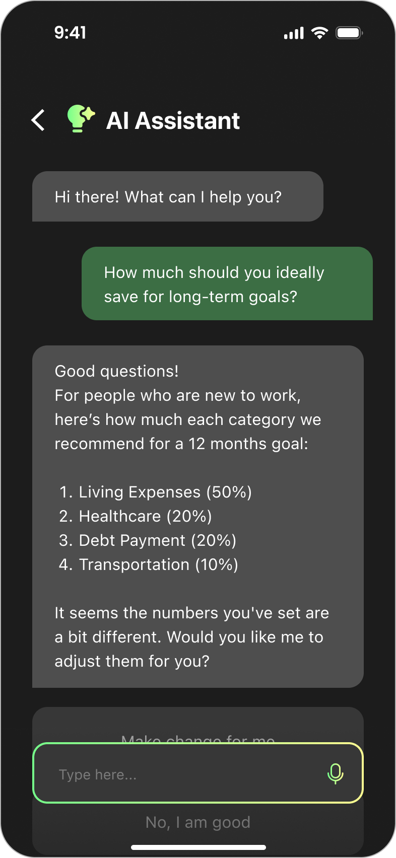

Improving Intuition and Personalization in Budgeting with AI Assistance
Users seek a more intuitive and personalized budgeting experience. Clearer labels, more distinct interactive elements, and better explanations for terms like "variable" would enhance user understanding. Additionally, users desire AI-powered suggestions that analyze their actual spending patterns, offering personalized advice to help them make more informed financial decisions.
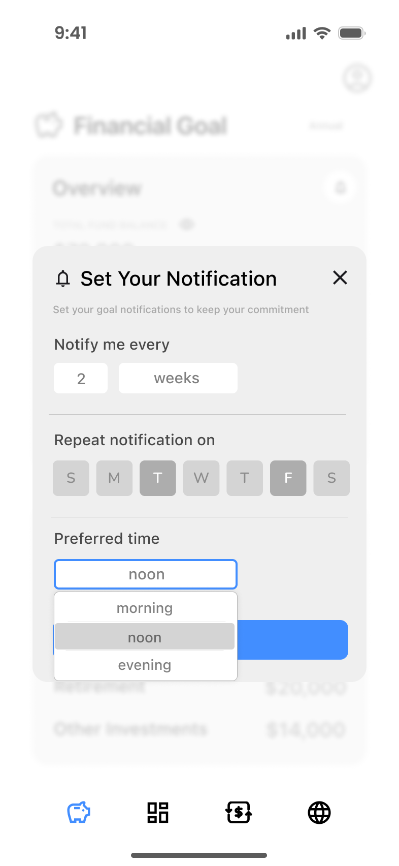

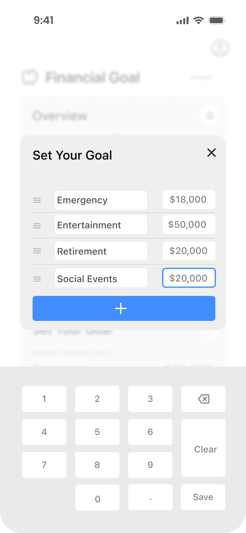
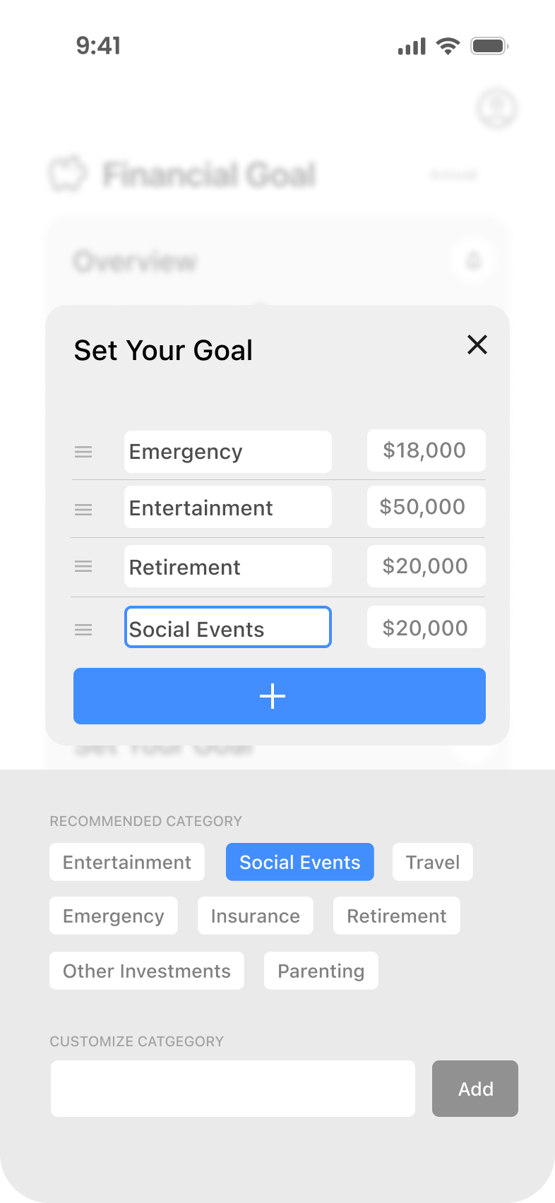
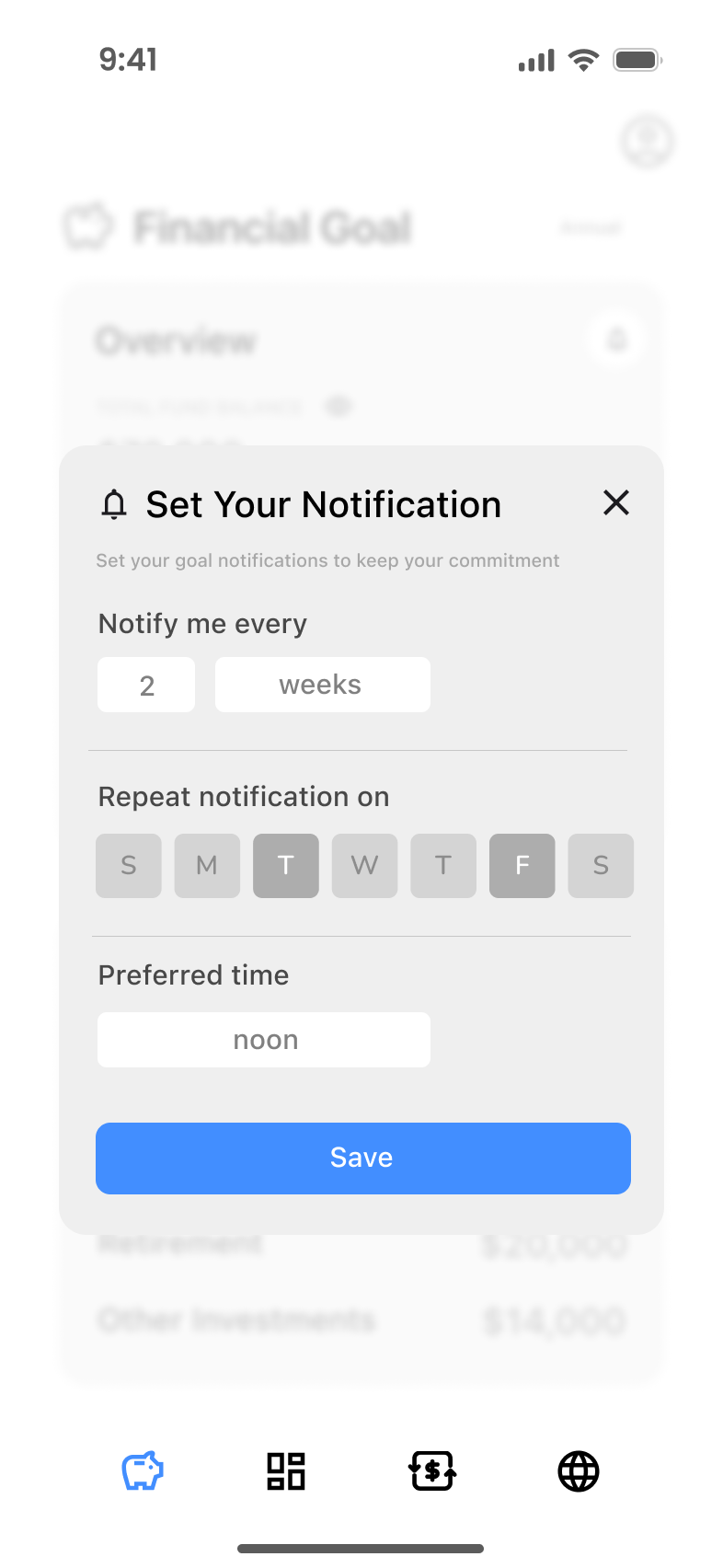
Streamlining Goal Setting and Customizable Notifications for User Clarity
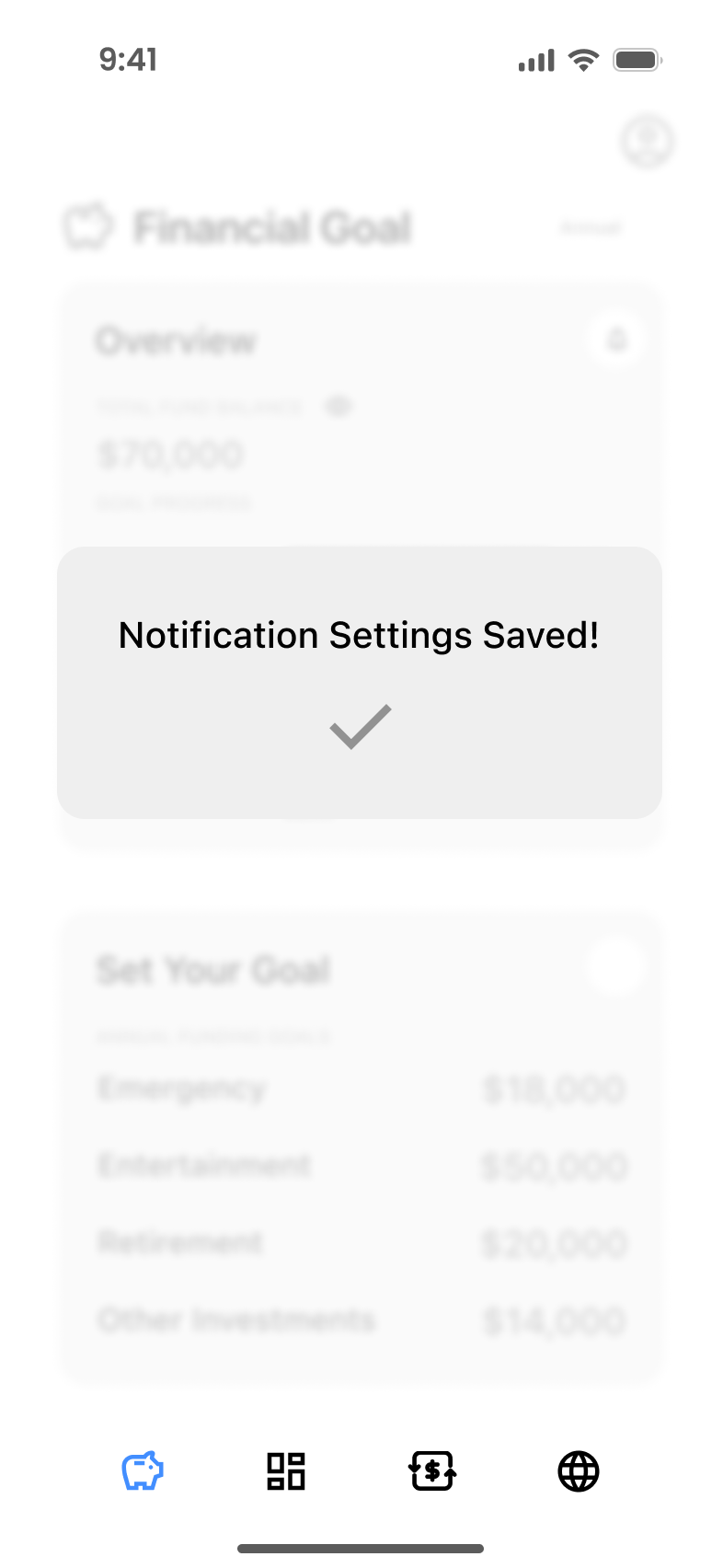
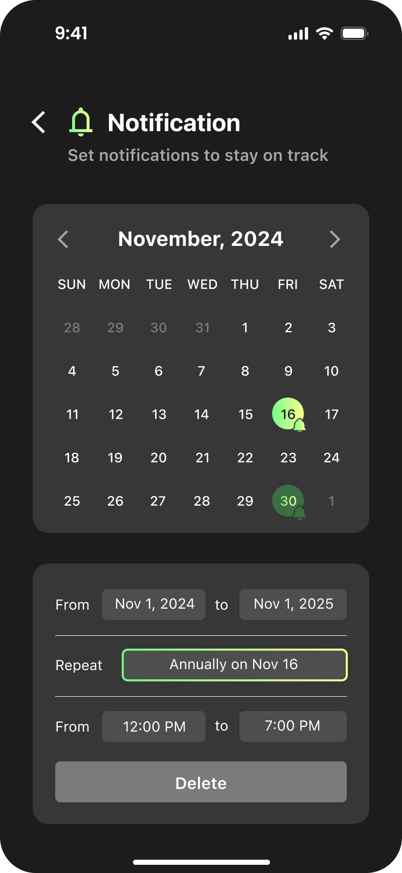
Users desire a more intuitive and seamless goal-setting and notification experience. Key areas of improvement include clearer interactive elements for editing goals, such as a visible save button or disabled state for the plus button during editing. For notifications, users prefer more control, like the ability to turn off notifications and a clearer presentation of notification time settings. They also want to see the entire notification settings at once and have the option to set specific time ranges for alerts, ensuring the interface remains user-friendly and avoids crowding.
Design Iterations & Metrics
leveraging the design opportunities uncovered through extensive research and user interviews, we were able to pinpoint the minimum viable products(MVPs) essential for addressing user needs and aligning Cashly with the product-market fit.
Iterated Feature 1
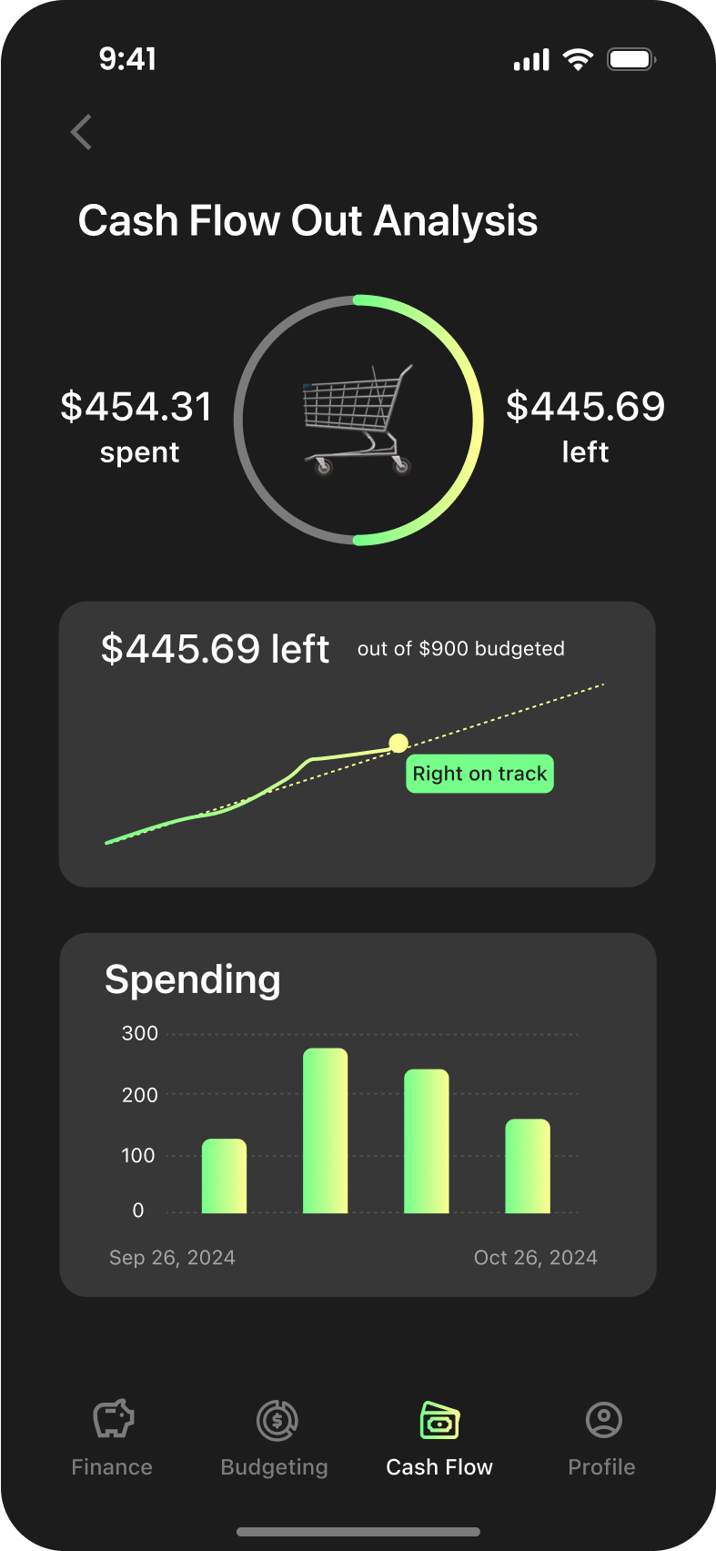
Cash Flow
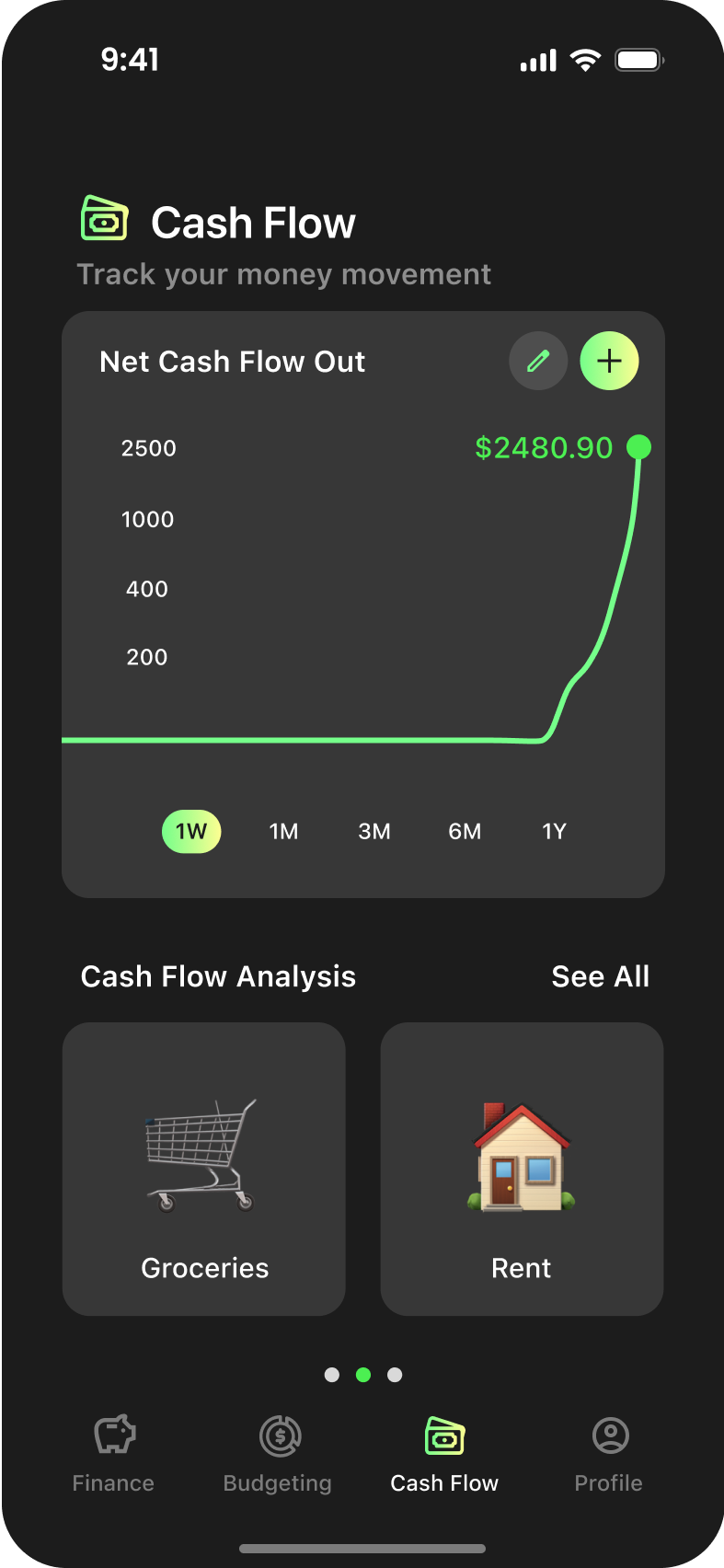

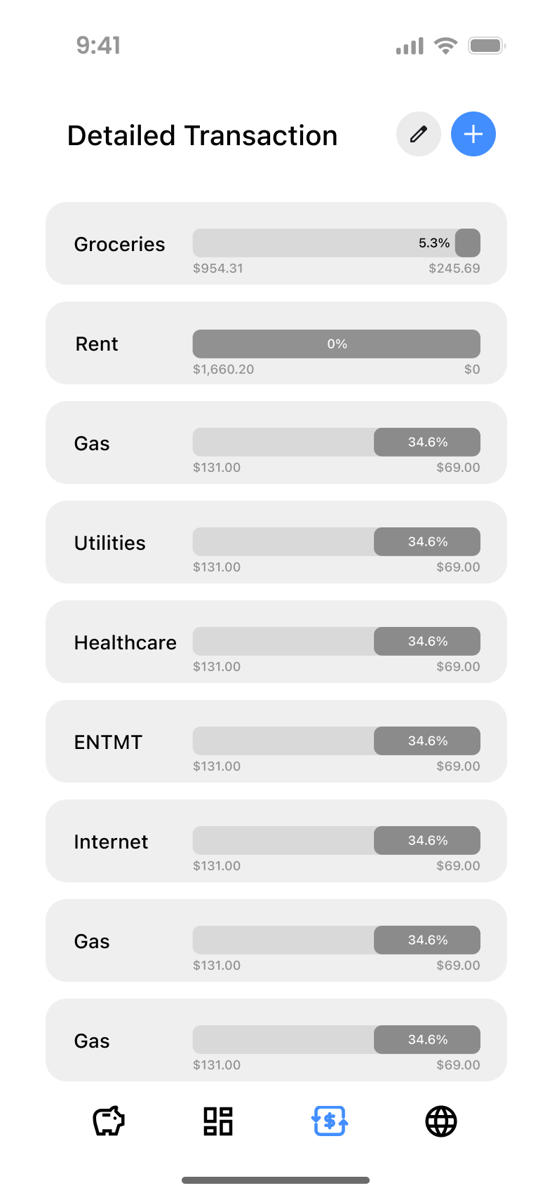
In-Depth Data Breakdown
Users can view detailed spending breakdowns with trends, remaining budgets, and curves. The Gestalt Principle of Similarity ensures a cohesive hierarchy, while feedback led to customizable options and accessibility improvements for better contrast and readability.
Navigation with Indicators
Swipe indicators were added to improve navigation between the three cash flow visualizations, following Nielsen's Heuristic's for visibility and system status. The Gestalt Principle of Continuity ensures smooth flow, while Hick’s Law reduces cognitive load for easier navigation.
Comprehensive Data Visualizations
The redesign replaced complex visualizations with familiar line and bar graphs, following Jakob’s Law to leverage user familiarity. An accessible color scheme and clear visualization principles improve usability and readability of financial trends.

Enhanced Time Selector Visibility
The redesign improved the unclear "1 Month" button by applying Nielsen’s Heuristics (visibility and recognition), Gestalt Laws (Proximity, Figure-Ground) for clarity, and Jakob’s Law to align with user expectations. An intuitive calendar icon and prominent placement enhance usability, while accessibility standards ensure sufficient contrast.
Enhanced Time Selector Visibility
To minimize confusion, captions and headers distinguish "Budgeting" (short-term) from "Financial Vision" (long-term). The redesign applies Hick’s Law to reduce cognitive load by structuring information into sections. Consistent labeling and design improve usability, while a refined color scheme ensures accessibility.
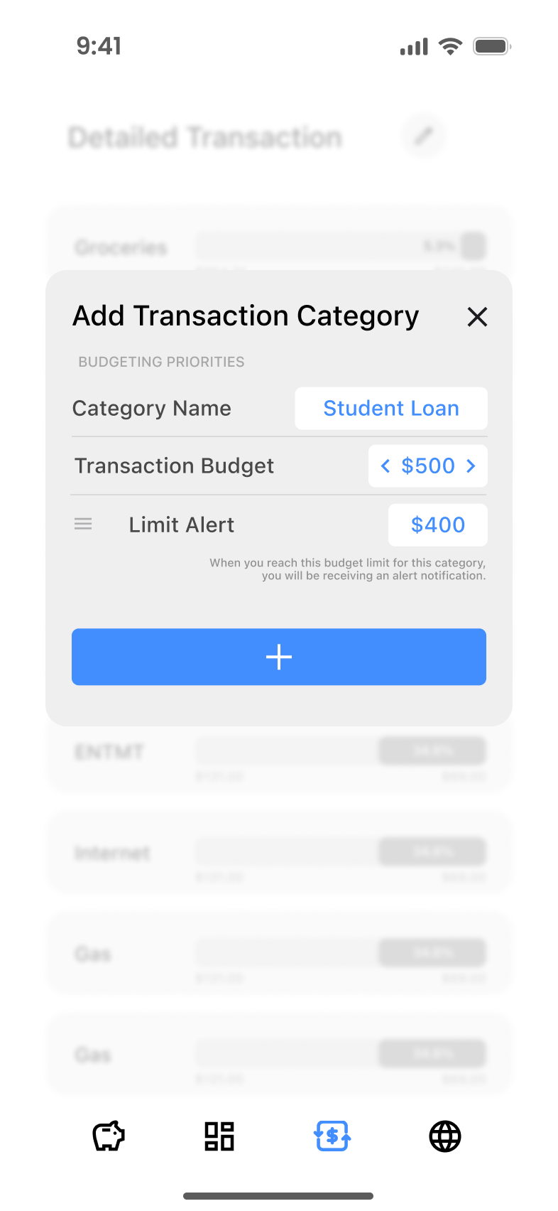
Guided Budgeting Breakdown
Detailed budget category explanations were added based on Jakob’s Law for familiarity with other tools. Gestalt Laws of Similarity and Continuity ensured visual cohesion, while accessibility standards improved readability. Design critiques led to a clearer, more educational user experience.

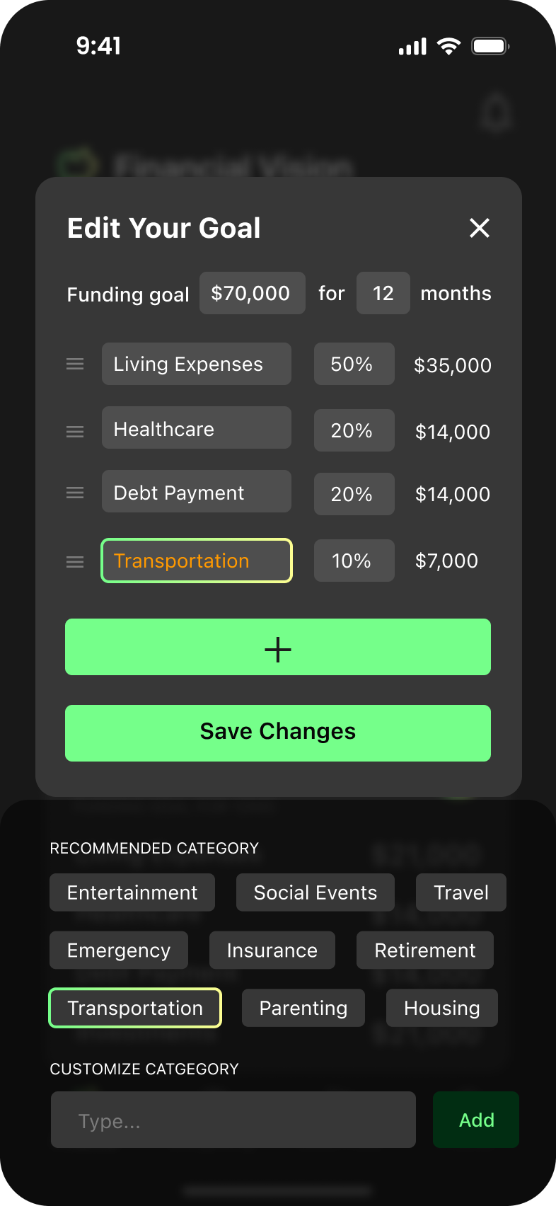
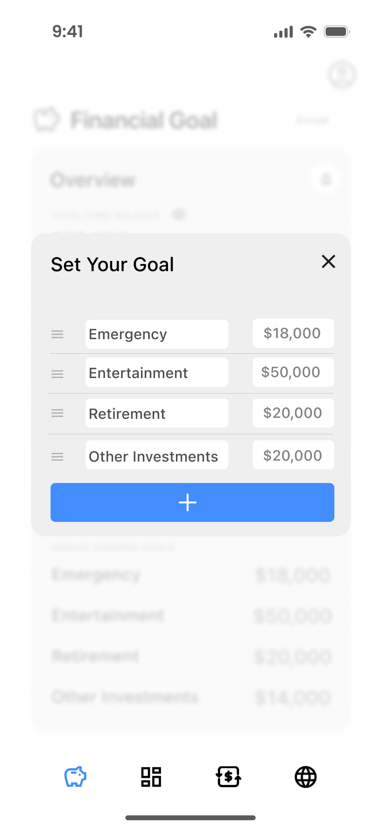
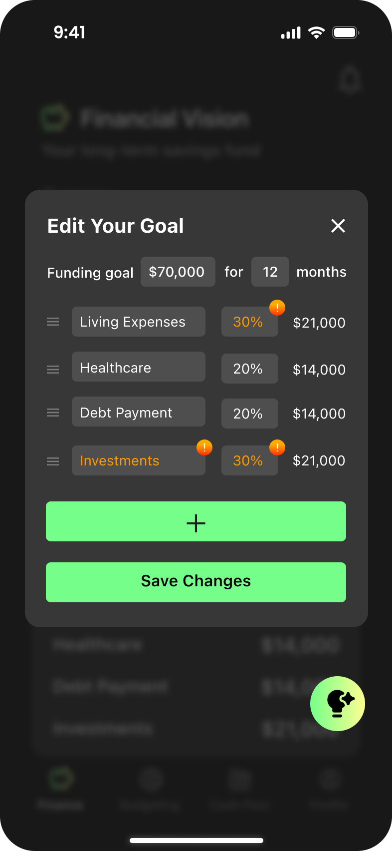
Percentage-Based Allocation
To address user uncertainty in allocating savings to each category, the redesign introduces a percentage-based approach. This approach starts with a total savings amount, allowing users to allocate percentages to various categories. Hick’s Law was applied to simplify the process, reducing cognitive load by guiding users step-by-step. This approach aligns with Design Principles of Consistency by ensuring a uniform interaction model throughout the app. Visual cues and labels improve clarity, making the allocation process intuitive and accessible.
Feedback with Alerts for Adjustments
The redesigned system incorporates alert indicators to guide users when their allocations deviate from recommended strategies. This feature adheres to Nielsen's Heuristic of Error Prevention, helping users make informed decisions and avoid over- or under-allocation. The Gestalt Principle of Feedback and Visibility ensures the alerts are noticeable but non-intrusive, using accessible color contrast to differentiate actionable alerts from general information.
Breakdown of Savings Categories
The savings setup now provides a breakdown of categories, leveraging earlier research on future savings strategies recommended by financial professionals. This follows Jakob’s Law, aligning the app’s approach with familiar budgeting frameworks users may have encountered. The visual hierarchy was improved using Gestalt Principles of Similarity and Proximity, grouping related elements for better clarity. Design critique insights helped refine the experience, ensuring the process remains straightforward and supportive for diverse financial goals.
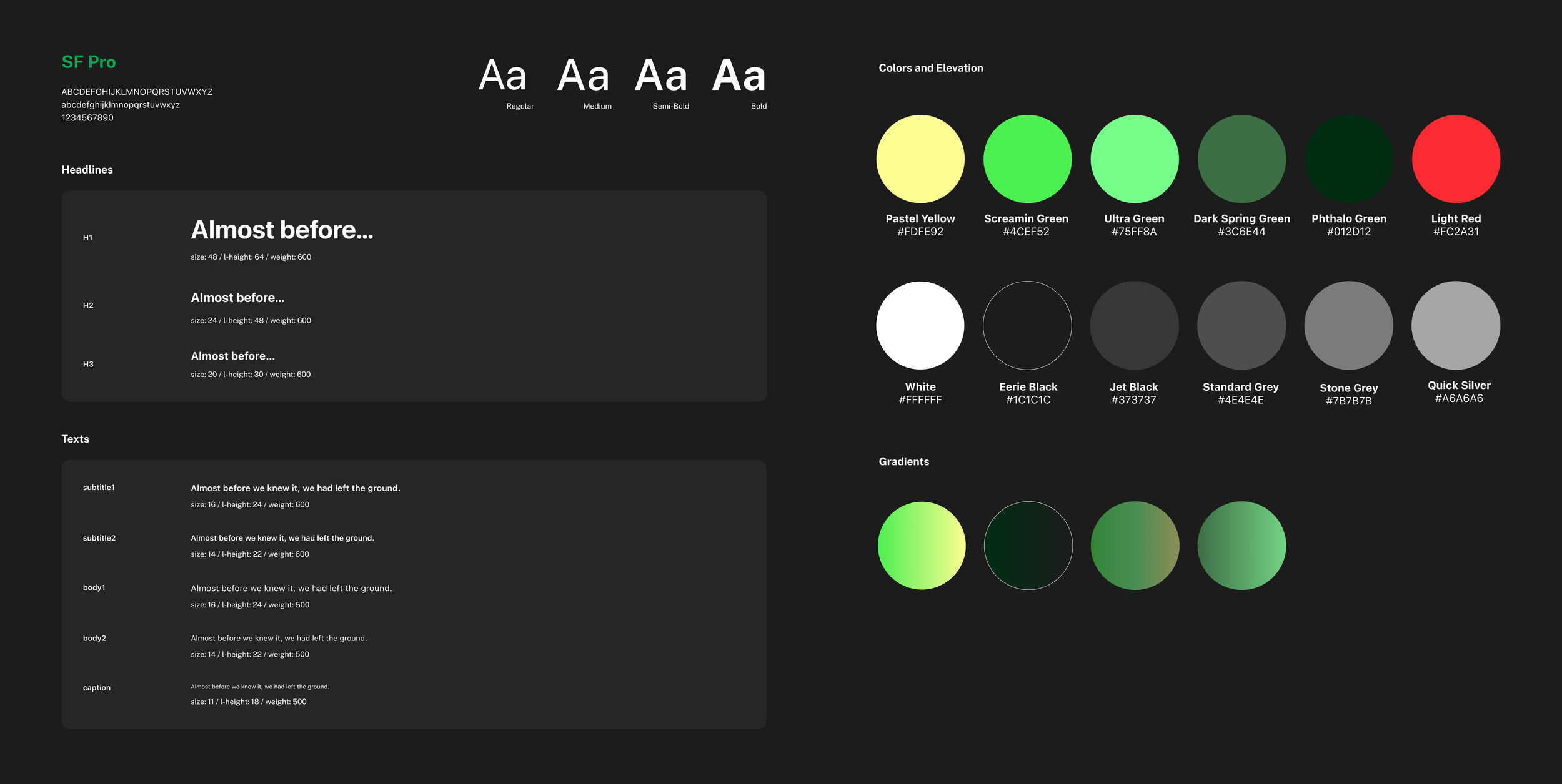
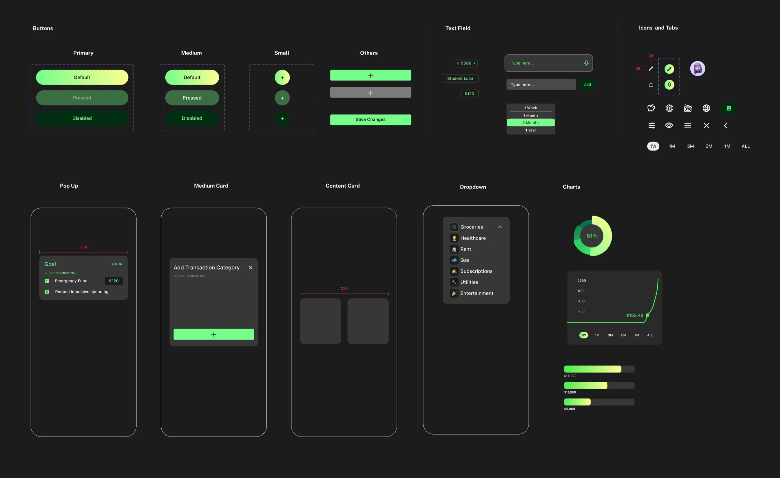
Design Style Guide
Design Impact 1
Developing Healthier Spending Habits
Our app promotes mindful spending to help users avoid impulsive purchases and provides regular feedback and support as they work toward their goals.
Design Impact 2
Creating a long-term vision for personal finance
The sense of accomplishment from meeting milestones encourages users to continue their progress, gradually turning positive actions into lasting habits.
